
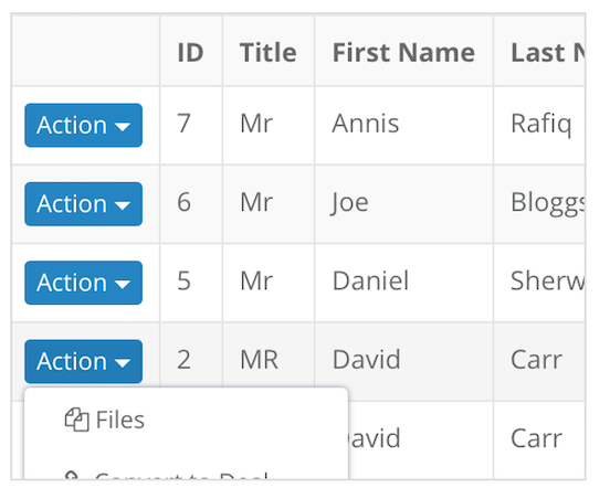
Bootstrap’s dropdown menu’s a great for display items in a tidy way but suffer for being cut off when on mobiles due to the class table-responsive the dropdown gets cut off from the overflow is set to hidden.
Such as like this image:
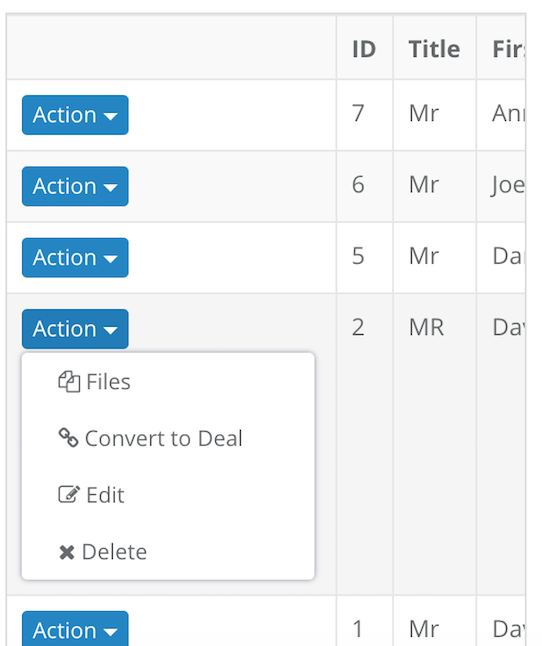
Thanks to leocaseiro for this handy css solution:
@media (max-width: 767px) {
    .table-responsive .dropdown-menu {
        position: static !important;
    }
}
@media (min-width: 768px) {
    .table-responsive {
        overflow: visible;
    }
}
Using this css stops the issue on mobile devices instead the dropdown takes up the content in the table cell:
Subscribe to my newsletter for the latest updates on my books and digital products.
Find posts, tutorials, and resources quickly.
Subscribe to my newsletter for the latest updates on my books and digital products.